Behold the mundane activities that make up our lives. Will my kids ever look back and read these posts to see that, all things considered, their lives weren’t as bad or unpleasant as they remembered?
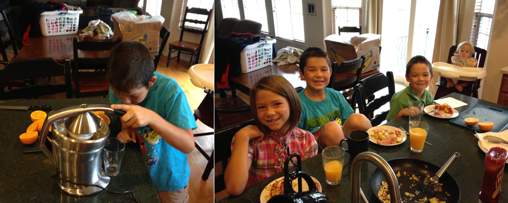
Fran bought some kind of super dooper orange press. The kids have been drinking a ton of fresh pressed orange juice. Lucky kids. I’m still waiting for someone to hand me a glass.
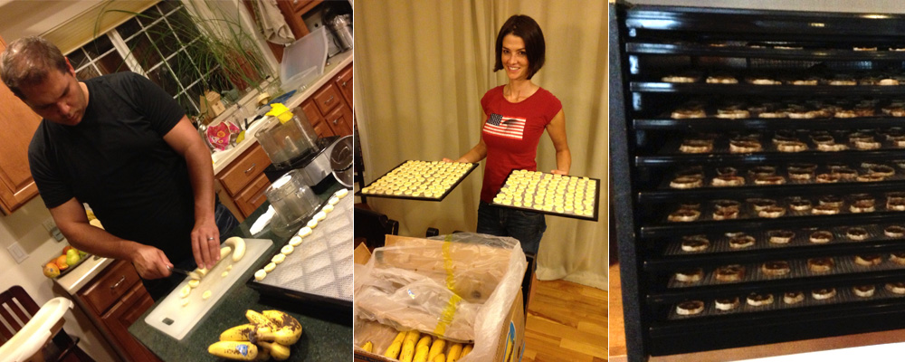
Next Fran bought a giant box of bananas. We cut them up and she popped them in a dehydrator so we could have banana chips. Yum (not really). Lots of fruity stuff going on over here. But whatever makes her happy is fine with me.
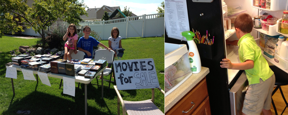
We decided to thin out our movie collection. We ended up with a pretty good sized pile of movies we were never going to watch again (a lot of them were duplicates from our Blu-ray migration). We sent the kids outside to sell them and told them they could keep whever they made. Lemonade stands eat your heart out. They made a few bucks and we were happy for them but mostly I was glad the Lehi Flasher didn’t show up.
Gabe was upset that he didn’t get any of the money (he opted not to help with the movie stand) so Fran put him to work cleaning. All the money earned was quickly wasted on junk. Long live American consumerism.
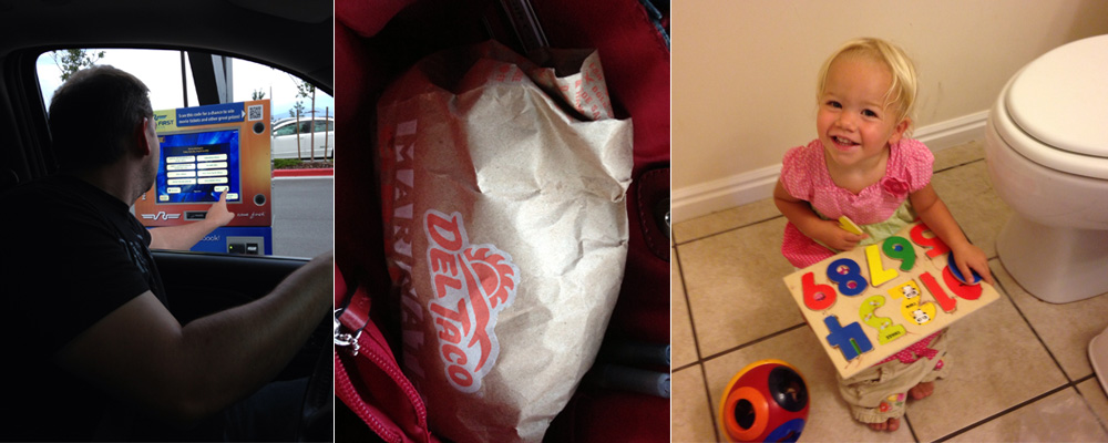
Fran and I hit up a movie (Paranoia- only so so) and decided to sneak in some tacos. I don’t know if you have to sneak food into the Megaplex Theaters (there’s not actually any sign prohibiting outside food), but my gosh it was exciting when those tacos emerged from the recesses of Fran’s giant food smuggling sized purse. Yum.
In other news Chloe has started potty training! She’s not quite two and that may be why she’s not quite getting it. Number one is going pretty well, but number two is always an exciting adventure. Fran has more patience than I do. If I had my way my kids would wear diapers until they went off to college.
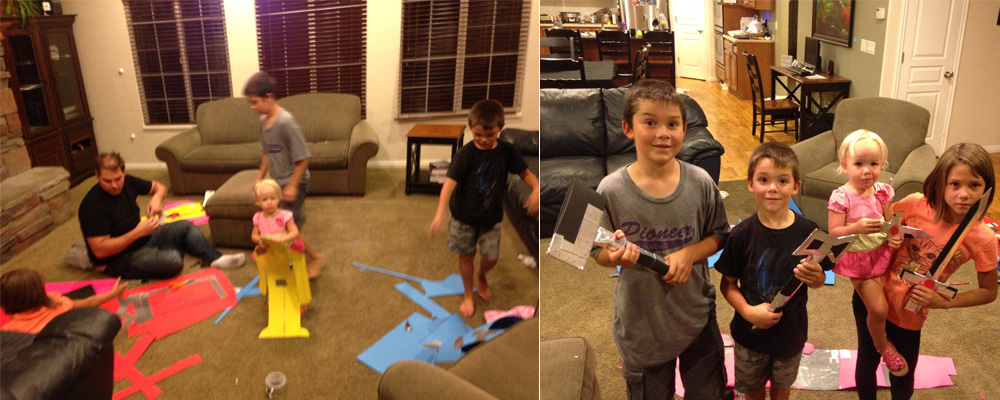
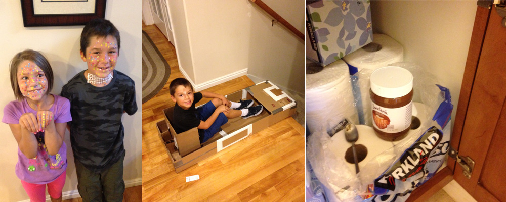
The other night I decided the kids and I should make robots to beat up (this was one of my favorite things when I was younger… lots of undiagnosed issues, I’m sure). All the kids got a robot and some punching lessons (Mike demonstrates here). I had roles of duct tape on hand to repair holes, tears and instances of dismemberment. Later I made the kiddos some cardboard weapons to use on the robots (and each other). A hammer, an ax, a dagger and sword all meted out massive amounts of damage and destruction and good time was had by all.
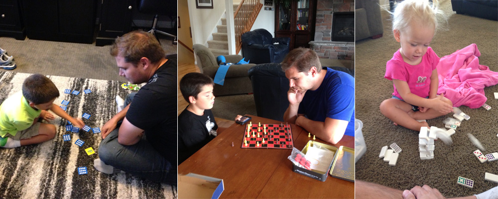
I confess that I’m not a huge fan of most games to begin with… but playing against kids can be mind numbing. I don’t find my kids numb my mind too much if we play the right games though. I’m always down for some memory, chess or Jenga (I think we’ll be ready to try Monopoly soon). I can also withstand about ten minutes of making towers for Chloe to knock over.
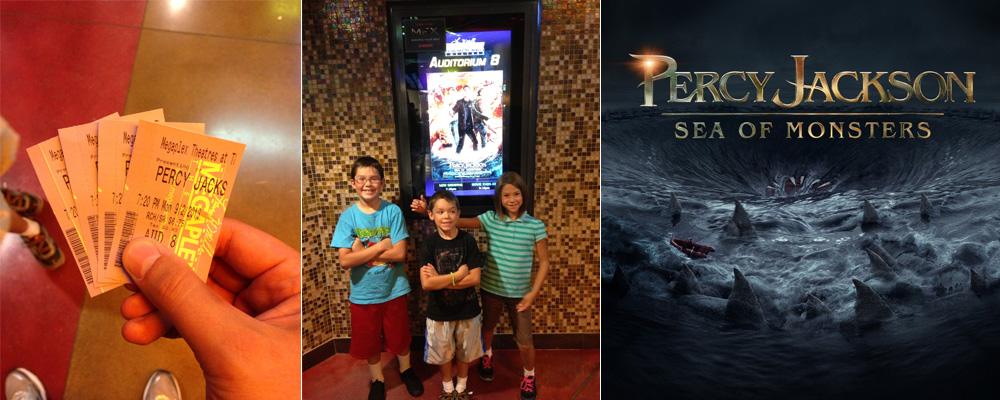
I took the kids to see Percy Jackson (pretty good!) because they were super excited about it (in fact I can’t think of anything they’ve been more excited about this year).

It’s been quite awhile since I’ve been pulled over (surprise!). On Labor Day we had a small window of time in the early morning and decided to head up to American Fork canyon for a quick hike. About two minutes into our journey we got pulled over. The reason? No insurance. I didn’t realize the police could tell if you had insurance or not by scanning your plate. But no worries- it was a simple misunderstanding. Right? Nope. We didn’t actually have an insurance card in our Yukon and the policeman wasn’t able to confirm through Allstate that we had insurance. Long story short: It turns out we didn’t have insurance. As soon as we bought the Yukon Fran had called to add it (and remove the vehicles we sold) but our local Allstate company dropped the ball and didn’t make any of the changes we requested (hopefully we’ll be able to get that all sorted out). Unfortunately this stop took so long that we had to turn around and go home. Perhaps fate intervened and stopped us from taking a fateful trip into the canyon that day? Who knows.
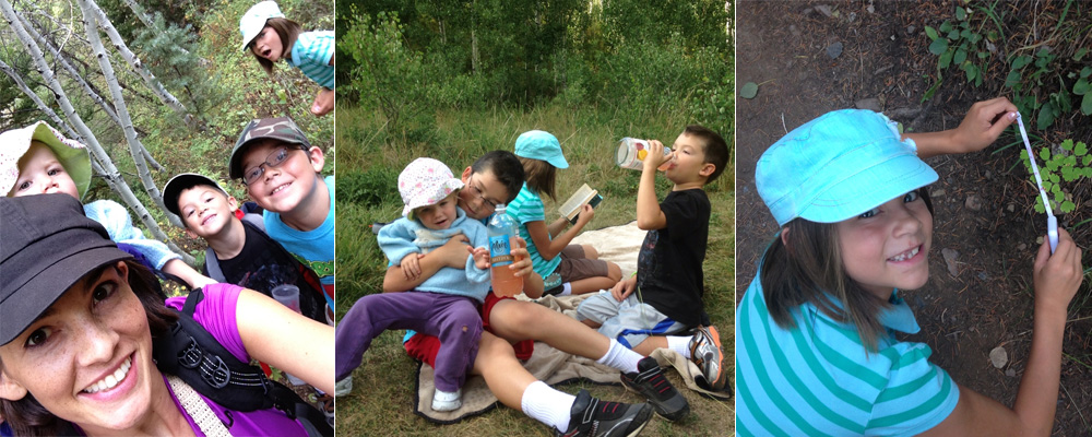
Fran and the kids temped fate later by actually making it to AF canyon and taking a hike (everyone survived). I can’t remember what I was doing- handling some problem, probably.
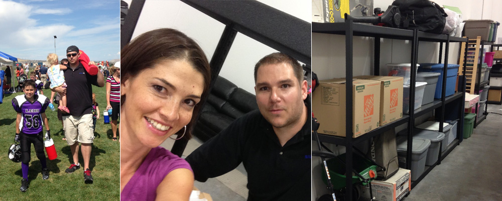
Mike has football games every Saturday now. Fran usually goes up at the start and I try to hit them toward the end. I’m not a big fan of football and I have to say that watching Mike’s team play doesn’t help. I’m glad Mike seems to like it though.
For our date Fran and I went to the new warehouse and took some time to organize our junk. I’ve said it before and I’ll say it again- I love those Costco shelves.

